A look at the evolution of an icon
CELEBRATING 75 YEARS — A look at the evolution of Sandia’s logo. (Animation by Andrew Dormody)

Sandia’s blue Thunderbird has been around longer than most of us can remember. As Sandia celebrates its 75th anniversary, the blue Thunderbird logo has become a beacon of the Labs’ enduring legacy. But how did this iconic emblem come to be? Lab News delved into the archives and spoke with Labs Historian Rebecca Ullrich to uncover the story of the Thunderbird logo’s origins and its journey through the years.
Two quick facts: First, an employee designed the Thunderbird logo. Second, it wasn’t originally created to be Sandia’s official logo.
Early history
The story of the Thunderbird logo begins in 1955, when the Labs held a contest to choose a design for five-and 10-year service pins. As part of the submission criteria, the entries could not include a mushroom cloud, which was part of Sandia’s original logo. That mushroom cloud logo was used starting in 1948 when the Z Division, originally part of Los Alamos National Laboratory, started being referred to as Sandia Laboratory. It was no longer used after Nov. 1, 1949, reflecting the Labs’ shift to an engineering focus when Sandia Corporation took over the contract to manage and operate Sandia.

“Sandia doesn’t do the physics package. It’s an engineering lab, and they wanted to emphasize that in their service pin design,” Rebecca said. “Employees submitted more than 200 entries and a committee narrowed it down to four.”
Voting time
The Technical Art Division, known today as Creative Services, helped prepare the final artwork before the designs were unveiled in the Aug. 12, 1955, edition of Lab News. Employees had one week to vote for their favorite.
The Thunderbird logo received the most votes, 532.
In the Aug. 26 edition of Lab News, the headline read, “Thunderbird Pin is Winner of Service Contest.”
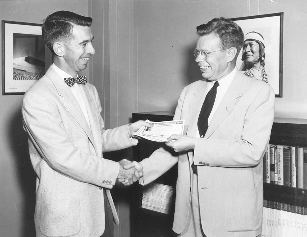
Its designer, Clyde Walker, received a $75 U.S. Savings Bond for submitting the winning entry. Walker, an electrical engineer who worked at the Albuquerque and Livermore sites during his career, had been working at Sandia for a mere five years when he submitted the winning entry for the pin contest.

Sandia’s early culture
Rebecca said the contest showed something important about Sandia’s culture in the early days.
“They were asking for the voice of Sandia. There was a very strong sense of community,” she said. As for participation in the contest, “It tells us there was a fair amount of engagement. The contest was important for underlining how the Lab was defining itself.”
An enduring design
The original turquoise Thunderbird had three distinct tail feathers and was set on a pentagon shape on a copper background.

“It was a very eye-catching and crisp design,” Rebecca said. “It was a very popular design that got picked up quickly by the graphic designers.”
By January 1956, Lab News was using the Thunderbird in its masthead. “By 1959, the design was used more generally as Sandia’s logo, not just on service mementos,” Rebecca said.
The logo has undergone only one major redesign, more than 50 years ago at the direction of then-President John Hornbeck, to align with AT&T’s branding overhaul. This modernized Thunderbird, with its sleek lines and bold posture, is the version recognized today.
“By 1971, the new Thunderbird was in use on publications and everywhere else, looking pretty much as it does today,” Rebecca said. “The Thunderbird is a very defined statement that this is Sandia.”
A legacy cemented
Today, the Thunderbird is synonymous with Sandia. It adorns the Thunderbird Café where employees gather, and it’s the emblem of the Thunderbird Kudos Award, which celebrates those who go above and beyond.
For many current Sandians, like Laura Hatfield, who remember seeing the blue Thunderbird logo at home because one or more of their family members worked at Sandia, it serves as a reminder of generations of service. Laura works in Creative Services and oversees Sandia’s brand. She said there are no plans to update or change the logo.
“The Thunderbird logo has so much history with the communities and customers we serve. People identify the Thunderbird with Sandia,” Laura said. “From an internal perspective, the Thunderbird cements that we’re one lab with one mission. Having one logo we can connect to is important.”