Sandia strives to provide exceptional service in the national interest, and now the Livermore, California, site is well on its way to exemplifying “exceptional” quality, too.
The campus recently completed its first major phase of the California Site Improvement Project. The goal was to transform what had been likened to an “abandoned fort” into looking like the modern, cutting-edge laboratory that Sandia already epitomizes, said Matt Green, the executive protocol officer who conceptualized the project.
“The site improvements are for our sense of Sandia camaraderie and for showing we care about the people who work here,” said strategic planner Joel Stauber, who helped drive improvements forward. “The project exceeded even my own expectations.”
The first phase of this undertaking earned the team — composed of more than a dozen collaborators — an Employee Recognition Award earlier this year.
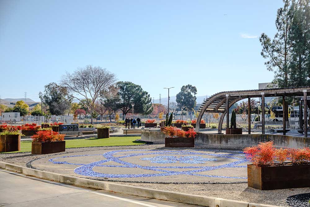
Two improvements, new monument signs plus water-wise landscaping along the main site entrance on Greenville Road, can be seen immediately when entering. Additional landscape improvements were made to Building 912’s plaza, which Associate Labs Director Andy McIlroy passes on the way to his office.

“I’m thrilled with the results of the California Site Improvement Project,” Andy said. “The new, environmentally friendly landscape and the striking signage have helped bring the campus into the modern era. It’s great when driving into campus or walking on-site to see the upgrades that have already been completed, as well as those underway.”
Upgrading the 912 plaza posed a challenge for the team. Due to basement laboratories and offices underneath, the new landscaping had to comply with weight restrictions. The team developed a Zen garden — in the shape of an atom — that offered a lightweight approach. The drought-friendly alternative lightened the load on the plaza by reducing soil weight and avoiding the need for irrigation.
Finding a way to a curated campus
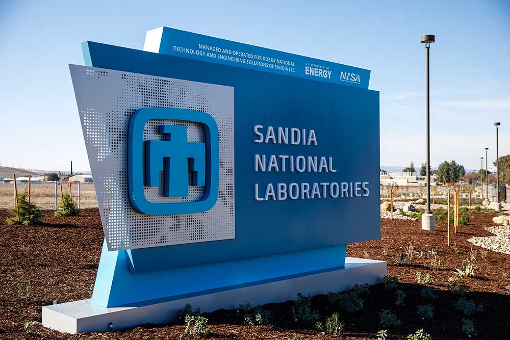
The other key element of the project was to revamp the two main signs leading onto the site — one on the east side’s open campus “front door” entrance and the other at Post 1’s entrance for workforce members on the west side.
“First impressions are really important,” Joel said.
He worked closely with Sandia creative designer Loren Stacks on the project. Loren used his background in sign design to create the new entry markers, which became a tribute to the era when Sandia New Mexico was founded in 1949, followed by the California location in 1956.
“The shape is inspired by mid-century design that used a lot of trapezoids, so it’s a very subtle nod to our history,” Loren said. “We’ve gotten tremendous feedback. Everybody loves that monument sign.”
Loren and Joel are encouraged by the positive reception, especially as they’ve been coordinating with counterparts in Albuquerque on a Sign Standards Committee to upgrade signage for Sandia as a whole.
“This is something I’ve always thought was a need — and that’s one thing I love about Sandia,” Loren said. “If you see a need for something and you have the skills to solve that problem, you can present the idea, and people will listen.”

The committee is collaborating on plans to eventually update signage for Sandia’s sites in Tonopah, Nevada; Kauai, Hawaii; and potentially more.
“It would be a way of helping to unify Sandia,” Joel said.
The new monument sign at Sandia California’s main entrance now helps distinguish the site from Lawrence Livermore National Laboratory across the street.
“It’s obviously an entrance now — it’s a destination, and it never felt that way before,” Loren said. “It instills pride in the workforce. And for visitors, it makes a good first impression and a lasting impression. It’s what a national lab should look like. We’re at the forefront of technology, and the look of the campus should match that.”
Improving the site now, and beyond
Joel and Loren are focusing on next steps for the California campus, including renovating the Visitor Badge Office and upgrading additional signage around the site.
Craig Taylor, director of California’s site operations, was an advocate for the project. He shared that he is proud to come to work on-site with many of the enhancements already in place.
“The California Site Improvement Project was designed to address state water conservation requirements, campus character and visitor wayfinding,” Craig said. “The resulting landscaping and signage have exceeded expectations. I can recall no recent facilities effort where I have received so many positive comments. It’s been truly transformational in so many ways.”