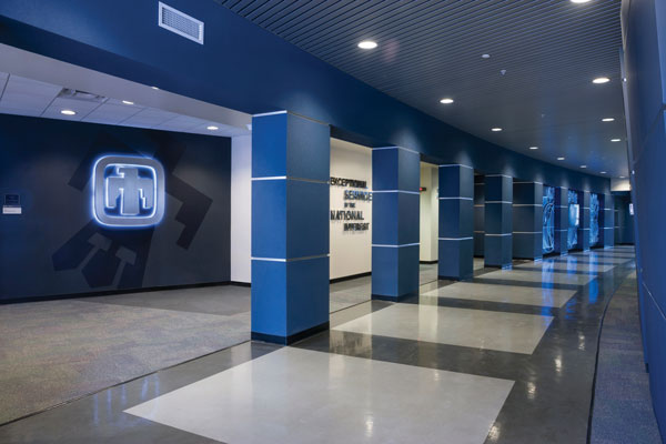
Recently tasked by Division 8000 leadership with helping to raise the profile of the Livermore site, the California communications department has developed a strategy and concept that will modernize high-traffic spaces and create an engaging experience across the campus.
“The idea is that as employees and visitors move through these spaces, they are left with a memorable impression of Sandia,” said Florencia Prada, California communications department manager. That becomes especially important to the division’s strategic priority around attracting and retaining talent, she said, noting that Sandia competes for talent with Bay Area tech companies, which typically have attractive, well designed workplaces.
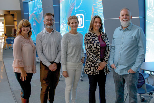
Over several months, creative designers Loren Stacks and Krissy Galbraith and creative services coordinator Trina West worked with managers Florencia, Donna Djordjevich-Reyna and Craig Tewell to create a branded experience for the café, main corridor and lobby of one of the campus’s main buildings. They also worked closely with the W80-4 communications and information management team on the California weapons engineering suites.
“Our approach was guided by two fundamental principles — flexibility and adaptability,” Krissy said. “The design needed to accommodate a growing demand for space at the California site and withstand the test of time. It was equally important that our spaces clearly reflect Sandia’s culture, mission and values and communicate the important work performed here.”
With a background in experiential design, Loren began developing a visual-design concept for several high-traffic spaces across the campus that would leave a statement about the high-impact work conducted at the Labs.
After months of planning and development, the team worked with vendors and the site’s procurement, information technology and facilities departments to install new physical design elements in early September. The timing worked out perfectly for an unveiling of the new design at the Sandia/California Family Day in September.
“We didn’t plan it that way. It was coincidental that the installation went up the week before Family Day, but it was really nice that we finished just in time,” Loren said.
On Family Day, Associate Labs Director for Integrated Security Solutions Andy McIlroy enjoyed showing the new designs to campus visitors.
“It’s been wonderful to see the experiential design project come together and hear how well it has been received by the workforce and guests,” Andy said. “Feedback has been uniformly positive regarding how we’re transforming the campus and creating excitement around Sandia’s culture and story.”
California café
In the Livermore campus café, three large LED-backlit fabric panels feature a fun and colorful abstract design that represents various areas of Sandia science and research. The design includes elements from across the Labs, such as molecules for chemistry, waves for physics, cells for biology and engineering drawings. In the center panel, Sandia’s thunderbird logo is the focal point of the design.
“All of these elements tie together in the illustration, representing how we’re all connected in working toward one mission — service in the national interest,” Loren said.
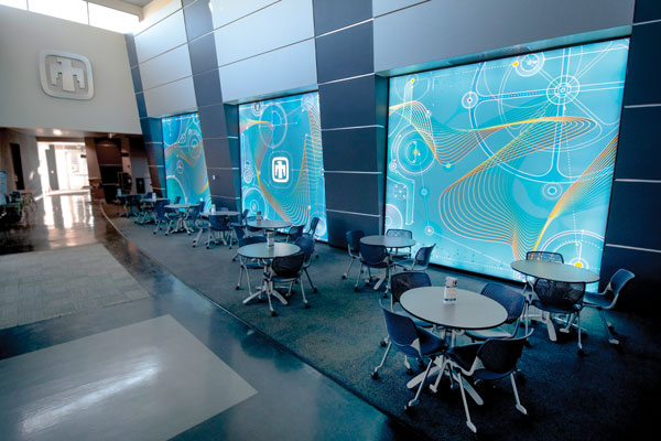
The design includes a diversity and inclusion element with different colored dots woven throughout the illustration, along with lines connecting those dots to each other and to the sciences.
In the days and weeks after the panels were installed, many employees and guests tried to make sense of the numbers, letters and symbols throughout the design.
“It’s been fun to see a lot of people engaging with the displays and trying to figure out the different design elements,” Loren said. “But it’s all just abstract — they don’t really mean anything literal.”
W87-1 weapons and computing suites
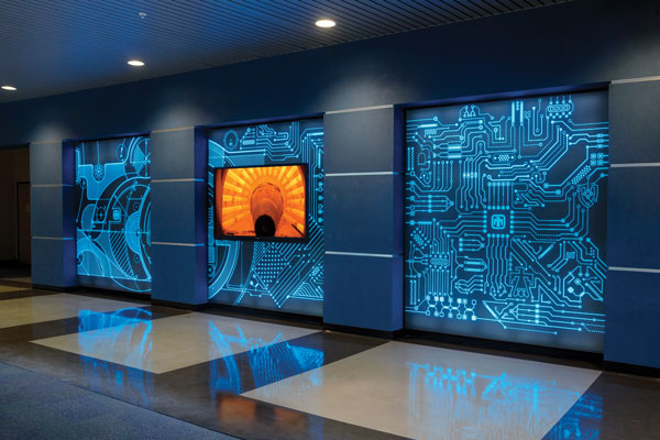
The lobby and corridor of the W87-1 weapons design and computing suites also have been redesigned, complementing the design concept in the café area.
“We had an opportunity to elevate this high-traffic area to a platform to communicate the important work performed in the building in support of Sandia’s mission — particularly in weapons systems engineering and cybersecurity,” Krissy said.
Three LED-backlit panels include a futuristic and technical pattern in black and Sandia blue. The left panel features an abstract engineering drawing and, on the right, a circuit board pattern. The design blends together in the middle to create one pattern — again symbolizing partnership and service in the national interest.
The LED panels surround a 70-inch digital display. The next stage of the project consists of developing interactive content for the display, to highlight Sandia’s mission and communicate detailed information about weapons systems engineering and cybersecurity through animated graphics, videos and interactive presentations.
If you look closely at the pattern of circuits and circles in the display, you will find several unexpected features, including an American flag pattern, the state of California, an atom, a Pac-Man ghost (portraying a cyber threat), the original Sandia thunderbird logo, a shield and small locks.
The corridor outside one of the meeting rooms was also redesigned to represent Sandia’s past, present and future. The modern thunderbird logo and Sandia mission statement are presented prominently in brushed aluminum with the classic thunderbird logo displayed subtly in the background.
By the end of the calendar year, a model of the B83 — the last megaton-class weapon in America’s nuclear arsenal — will be suspended in the stairwell between the building’s two floors. Wallpaper with blue skies and clouds now furnishes the walls in preparation for the installation. In the next phase of the project, designers will expand other weapons exhibits throughout the first-floor lobby and corridors.
W80-4 weapons suite
Hallways and conference rooms in the W80-4 weapons suite were also given a refresh this fall. The illustrations throughout the workspace keep much of the same look and feel as the public displays in the W87-1 suite.
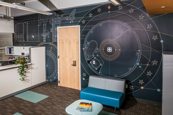
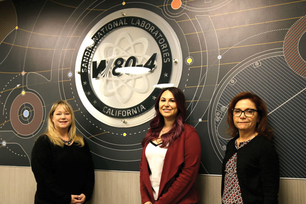
The environmental design team worked with the W80-4 communications and information management team, including Amanda Cervantez, Jana Cuiper and Noel Richmond, to develop the new design concept for the weapons engineering suites. The California designers deconstructed the W80-4 logo and used elements of the logo throughout the illustration, combined with engineering designs and graphics of the external image of the warhead.
Looking ahead
Everyone involved in the experiential design project was gratified to see the visual transformation take place, and they look forward to future opportunities to expand the branded experiential design to other buildings and spaces at Sandia/California.
Additionally, the team will continue to bring digital interactive kiosks online across the Livermore campus in order to communicate fresh and relevant content, including details of upcoming campus events and other important division announcements. This versatile medium provides an efficient way to provide real-time communication while eliminating paper and poster waste.