Bringing a ‘wow’ factor to Sandia’s front door
Between the expansive, blank lobby walls in Sandia/California’s Human Resources building and the interview candidates who may wait for 30 minutes or more, Kim Edson, senior manager of Business Operations & Human Resources, saw potential.
“Many of our interview candidates tend to arrive really early. Every day I’d see them sitting in the lobby surrounded by white walls,” she says. “We were missing an opportunity to make an impact on candidates and show them what Sandia is all about.”
Transforming the HR lobby into a Sandia showcase
Enter creative designers Loren Stacks and Krissy Galbraith of the California Communications and Information Management department.
“This was an amazing opportunity for us to create a large-scale environmental design and turn that lobby into a showcase for Sandia,” says Loren.

Working on a tight deadline — the project had to be completed in less than six months — Krissy and Loren sought inspiration from a number of sources. They went on virtual tours, scouring the internet for images of environmental design at high-tech companies across the country.
“Sandia competes for talent with local tech companies, which typically have well-designed lobbies that wow their candidates,” says Krissy. “Our goal was to make sure that we were on par with those spaces and bring that same wow factor to Sandia’s front door. It was equally important to capture what makes Sandia unique: the people and the culture.”
A bold yet subtle design
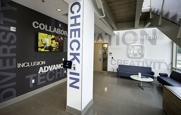
With his background in environmental design — see the Isleta resort in Albuquerque for proof — Loren recognized that architectural lettering would yield high impact for less cost than other design options. Using the Sandia purpose statement as a theme, the designers transformed the HR lobby walls with words like INNOVATION, DIVERSITY, and CREATIVITY.
“We wanted to be bold with our design but still work with the architecture and existing color palette of the space,” says Loren. Along with a warm charcoal paint chosen to ground the design, Krissy and Loren selected low-contrast white and gray tones for the vinyl and frosted-acrylic letters. The acrylic letters appear to float over the larger vinyl letters, which wrap corners and run across doors and walls to create dimension. Like the letters, the brushed-aluminum Sandia thunderbird is daring in size, yet subtle in color.

The design follows the path a candidate might take in the HR building, starting with a mounted iPad where candidates check in electronically, notifying the HR associates and the HR office management assistant. A large monitor plays Sandia videos and photo slideshows to inform and inspire candidates while they wait. As candidates are led into the HR suite toward the interview room, they are greeted by an oversize Sandia thunderbird logo, again in brushed aluminum, on the wall behind the OMA’s desk.
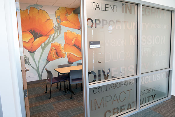
Inside the interview room, the design takes a decidedly different turn. “We wanted a pop of color and a design to express our California identity,” says Krissy. After mulling over several iconic California images — the Golden Gate Bridge, beaches, vineyards — they settled on the state flower, the California poppy.
Krissy hand-illustrated an original piece of art to showcase the bright orange flower. She and Loren then turned the artwork into a digital image, which was rendered on a canvas, textured wallpaper to cover the room’s back wall. The wallpaper material was chosen for its durability, low cost, and ease of updating.
Bringing environmental-design concepts to life
After months of planning, presenting the design to various groups around the site to gain buy-in, and working with vendors to create the physical design elements, Krissy and Loren were gratified to see the lobby and interview room transformed over the course of a single week. The designers partnered with the Facilities department on project management and installation.
Even though the design has been complete for two months, Kim still feels a jolt of excitement each time she walks into her building. And she no longer minds seeing candidates wait in the lobby.
“Now they are walking around, reading the different words on the wall, and learning about our mission, research, culture, and people as they wait,” says Kim.
Everyone is invited to visit Bldg. 926 to see the environmental design firsthand. You can check out this time-lapse series of photos documenting the installation of the building’s multiple design elements.